By Lee Garvey
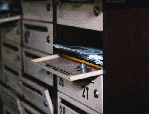
Your inbox overflows and social feeds never stop, yet colorful flyers in physical mailboxes still make you pause. Tangible mail cuts through digital noise like nothing else.
The difference between trashed direct mail flyers and action-driving ones comes down to smart design choices. Here are 10 proven techniques that transform ordinary flyers into response-generating powerhouses.
Launch 500 postcards in ~5 minutes. We print, address, and mail for you.
Upload your design and mailing list, pay, done. No post office run. No subscriptions. Next-business-day mailing for most products.
- Postcards (bulk or 1-to-1)
- Letters & Certified Mail™
- Flyers & Brochures
1. Lead with Your Strongest Headline in the Top Third
Place your primary message in the largest, boldest text where eyes naturally land first. Your flyer has about three seconds to make an impression before it gets recycled. Make those seconds count with a headline that hits hard and hits immediately.
Action step: Write your headline in 36-72pt font and position it in the upper third of your flyer. Test headlines that promise specific benefits rather than generic company descriptions.
2. Choose Images That Tell Your Story Instantly
Select visuals that communicate your key benefit without requiring explanation. Avoid generic stock photos that could represent any business. Your images should be so specific to your offer that competitors couldn’t use them.
Action step: Use before/after photos, product demonstrations, or customer results instead of lifestyle stock images. Real photos of your actual work convert better than perfect stock imagery.
3. Apply the 3-Color Rule for Visual Cohesion
Limit your palette to three main colors to maintain visual cohesion while ensuring sufficient contrast for easy reading. Too many colors create chaos; too few create boredom.
Action step: Pick one primary color (your brand), one accent color (for highlights), and one neutral color (black or dark gray for text). Stick to this palette throughout your entire flyer.
4. Use the 60/40 Visual-to-Text Ratio
Aim for 60% visuals and 40% text. Images process faster than text and create immediate emotional connections. Your flyer should be scannable in seconds, not require careful reading.
Action step: If your flyer feels text-heavy, replace paragraphs with bullet points, icons, or infographics. Let images carry the emotional message while text handles the details.
5. Create One Clear Focal Point
Design around one primary element that draws the eye immediately – whether it’s a compelling image, bold headline, or striking graphic. Multiple focal points create confusion and reduce response rates.
Action step: Squint at your flyer. What catches your eye first? If it’s not your most important message, redesign until it is.
6. Make Your Call-to-Action Impossible to Miss
Replace vague phrases like “contact us” with specific, benefit-driven commands like “Call now for your free estimate.” Your CTA should tell readers exactly what to do and what they’ll get.
Action step: Use a contrasting color for your CTA button or box. Include your phone number in at least 14pt font. Add urgency with phrases like “Call today” or “Limited time.”
7. Give Important Elements Room to Breathe
Use white space strategically to prevent a cramped, unprofessional appearance. White space isn’t wasted space – it’s a design tool that makes your message more readable and memorable.
Action step: Add 25% more white space around your headline, CTA, and key images. If it feels too empty, you’re probably getting it right.
8. Design with the Fold in Mind
Remember that self-mailers are folded during production. Ensure critical information remains visible and readable across fold lines. Don’t let important details disappear into creases.
Action step: Create a simple mockup by folding a piece of paper to match your flyer format. Mark where fold lines will fall and keep essential elements away from these areas.
9. Leverage Color Psychology for Emotional Response
Different colors trigger different emotions. Red creates urgency, blue builds trust, green suggests prosperity or savings. Choose colors that align with your desired audience response, not just your brand preferences.
Action step: Use red for urgency (“Limited time”), blue for trust-building (financial services), or green for savings offers. Test different color combinations on small batches before full campaigns.
10. Test Print Readability at Actual Size
What looks good on screen may become illegible when printed, especially in smaller sizes. Choose clean, professional typefaces for body text and reserve decorative fonts only for headlines.
Action step: Print your flyer at actual size on your office printer before sending to professional printing. If you can’t read the phone number clearly, neither can your prospects.
Let Click2Mail Help You Deliver the Perfect Flyer Fast
Ready to put these design tips to work? Click2Mail eliminates every barrier between your flyer design and your prospects’ mailboxes. No minimum orders, no subscription fees, no mailroom hassles – just upload your design and they’ll have it printed on premium stock and delivered within 24 hours. Whether you’re testing 50 flyers or scaling to 50,000, their platform handles printing, folding, postage, and delivery while you focus on results.
Call our direct mail experts at 866-665-2787 to discuss your campaign strategy, or visit Click2Mail.com to upload your design and start mailing today. Your competition isn’t waiting – why should you?

About Lee
Lee Garvey is the founder of Click2Mail, a pioneering platform in cloud-based direct mail automation since 2003. Under his leadership, Click2Mail has become a trusted USPS partner, helping thousands of businesses streamline their mailing processes and effectively bridge the gap between digital and physical marketing.