By Lee Garvey
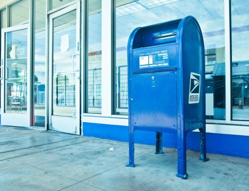
While everyone else fights for inbox space and battles ad blockers, smart marketers are quietly crushing their competition with a 100-year-old technology that lands directly in customers’ hands. Postcards enjoy a 100% open rate – something no email can claim – and give you exactly two seconds to grab attention before they hit the trash can.
The difference between those two outcomes isn’t luck. It’s strategy. The most successful postcard advertisements follow specific design principles that have been tested across millions of mailings, revealing counterintuitive truths about what actually drives response rates versus what looks pretty in a design portfolio.
Launch 500 postcards in ~5 minutes. We print, address, and mail for you.
Upload your design and mailing list, pay, done. No post office run. No subscriptions. Next-business-day mailing for most products.
- Postcards (bulk or 1-to-1)
- Letters & Certified Mail™
- Flyers & Brochures
Essential Design Principles for High-Converting Postcard Ads
The biggest mistake advertisers make with postcards is treating them like miniature brochures. When someone has only seconds to process your message while sorting through their mail, complexity kills conversion. The most successful campaigns follow one fundamental rule: one postcard, one message. If you try to explain your entire business on a 4×6 inch card, your message disappears into visual noise.
• The Single Message Rule: Focus on one clear headline with minimal supporting text. Your postcard should answer one question or solve one problem, not showcase your complete service menu.
• Visual Hierarchy: Structure information so the most important element – usually your headline – dominates the design. Secondary elements should support, not compete with, your main message.
• Iconography Over Text: People process images faster than words. A hair salon that used scissors and blow dryer icons instead of fancy script lettering saw immediate recognition, even from drivers passing their mailbox.
• The 2-Second Test: Show your design to someone for two seconds. If they can’t tell you what you’re offering and what action to take, redesign it.
• Strategic White Space: Empty space isn’t wasted space – it’s a spotlight that directs attention to your key message and prevents visual overwhelm.
15 Postcard Advertisement Examples That Convert
These examples demonstrate the principles in action, showing how businesses across industries have created postcards that drive measurable results. Each example illustrates specific strategies that can be adapted for your own campaigns.
Local Service Businesses
Hair Salon Back-to-School Special: Featured prominent scissors and blow dryer icons instead of fancy script lettering, making the business type instantly recognizable. The headline “Back to School Special $29” was displayed in clear, readable font with minimal supporting text about the offer details.
HVAC Seasonal Maintenance: Used a simple thermostat icon with the headline “Beat the Heat – $89 Tune-Up” sent just before summer. The back included three bullet points about what the service included and a phone number, demonstrating the single-message principle.
Real Estate
Investment Property Buyer: Text-heavy postcard filling every line with copy like “My wife and I are trying to get into investing and we saw this property and would like to help by buying it from you.” The personal, letter-like approach outperformed polished designs.
Just Sold Announcement: Highlighted two key metrics – selling price versus asking price and time to sell. “SOLD in 2 Days – Listed at $340K, Sold for $355K” became the entire front-side message.
Pick Your Neighbor Campaign: Real estate agents promoted available properties with “Pick Your Neighbor – New Listing on Your Street” followed by property details and agent contact information.
Retail and E-commerce
Free Gift Promotion: Local florist offered “Free Vase with Any $25 Purchase” after their 25% discount failed to generate response. The tangible gift offer brought immediate traffic.
BOGO Furniture Store: “Buy One Dining Chair, Get One Free” with large product photo and store location. The loss aversion psychology drove higher foot traffic than percentage discounts.
B2B Services
Continuing Education Provider: Targeted licensed professionals with “Earn Your Required Credits – 8 Hours, One Day” featuring the specific credit hours and simplified registration process.
Commercial Solar Installation: Reached property managers with postcards showing aerial building photos and “Perfect Roof for Solar – Estimated Annual Savings: $12,000” based on the building’s square footage.
ATM Service Provider: Targeted cannabis dispensaries with cash-heavy operations using “Cash Business? We Install ATMs” with simple setup process outlined.
Professional Services
Insurance B2B Outreach: Used “Protecting Local Businesses Since 1987” with three industry-specific coverage examples and a local phone number.
Medical Practice Staffing Update: Featured professional headshots of new staff members with “Meet Our New Nurse Practitioner” and brief credentials to build patient relationships.
Dental Appointment Reminder: Combined appointment confirmation with “Thank You for Choosing Us” message and included QR code linking to patient portal.
Interactive and Technology Integration
Utility Company Rate Change: QR code linked to personalized video explaining “Why Your Coop Rates Changed” with the customer’s specific account impact.
Video Mailer Integration: High-value prospects received postcards with embedded video screens playing targeted sales messages, achieving premium response rates for luxury services.
Handwritten AI Postcards: Property buyers used neural network technology to create postcards that appeared handwritten on legal pad paper, generating high open rates in competitive markets.
Counterintuitive Postcard Advertisement Strategies That Work
Sometimes the designs that make graphic designers cringe are the ones that make cash registers sing. After analyzing thousands of successful campaigns, patterns emerge that challenge conventional wisdom about “good” design. The postcards that generate the highest response rates often break traditional design rules in deliberate ways.
The Speedbump Strategy: When Ugly Fonts Work
Conventional wisdom says to use clean, readable fonts. But unconventional typography can create what direct mail experts call a “speedbump” – a visual interruption that forces people to slow down and actually read your message. When someone sees an unusual font choice, their brain pauses to process what they’re looking at, buying you precious extra attention time.
This technique works especially well when your audience receives lots of polished marketing materials. Your slightly jarring design stands out precisely because it doesn’t look like everything else.
Text-Heavy Designs That Convert
Real estate investors discovered something that contradicts every design school principle: postcards packed with text, filling every available line from edge to edge, consistently outperform clean, minimalist designs.
These text-heavy cards work because they feel personal and urgent, like someone sat down and wrote you a real letter. The key is making the dense text feel intentional rather than accidental, with every line serving a specific purpose in your sales argument.
The A/B Testing Imperative
Never assume your “ugly” design will work without testing it against a conventional approach. Split your mailing list and track response rates for both versions. Measure not just immediate responses but also long-term customer value, since different design approaches may attract different quality prospects.
Document what works for your specific audience and industry, because counterintuitive strategies that work for real estate investors might fail for luxury service providers.
Start Testing These Strategies Today with Click2Mail
Having the right design principles means nothing without the infrastructure to execute them quickly and cost-effectively. Traditional printing and mailing processes take weeks and require minimum quantities that make A/B testing expensive. Meanwhile, your competitors are already implementing these strategies and capturing market share.
Click2Mail eliminates these barriers by handling everything from design to delivery through their online platform. Upload your postcard design, select your mailing list, and your cards mail the next business day – no minimum quantities, no subscription fees, and no mailroom headaches. Their pricing starts at just $0.53 per postcard, making it affordable to test multiple design variations and offers until you find your winning combination.
Whether you need their design templates to get started or want to integrate postcard campaigns into your existing marketing automation through their API, Click2Mail gives you the tools to turn these proven strategies into revenue. Start your first campaign today and discover which of these high-converting approaches works best for your business.

About Lee
Lee Garvey is the founder of Click2Mail, a pioneering platform in cloud-based direct mail automation since 2003. Under his leadership, Click2Mail has become a trusted USPS partner, helping thousands of businesses streamline their mailing processes and effectively bridge the gap between digital and physical marketing.